UX Case Study
Enpara Case Study —
Enhancing the Money Transfer Experience in a Digital Banking App
Role: Product Designer
Scope: UX research, user flow mapping, wireframing, UI design, and microcopy writing
Problem Definition 🔍
The current money transfer flow in the Enpara app had issues with information overload, lack of feedback, and unclear next steps. These created a less confident and slower user experience.
Objective 🎯
My goal was to redesign the entire IBAN transfer journey to be clearer, faster
and more intuitive helping users feel confident and in control throughout the process.
Design Process ⚡️
Each design decision was shaped by user needs and business goals.
Below is a breakdown of the process I followed to improve the money transfer flow.
01.
Flow Mapping
I started by mapping out the current transfer flow and identifying each step where users make decisions or encounter friction.
02.
Identifying UX Pain Points
Key pain points included lack of field hierarchy, missing real-time validation, and unclear feedback after the transaction was completed.
03.
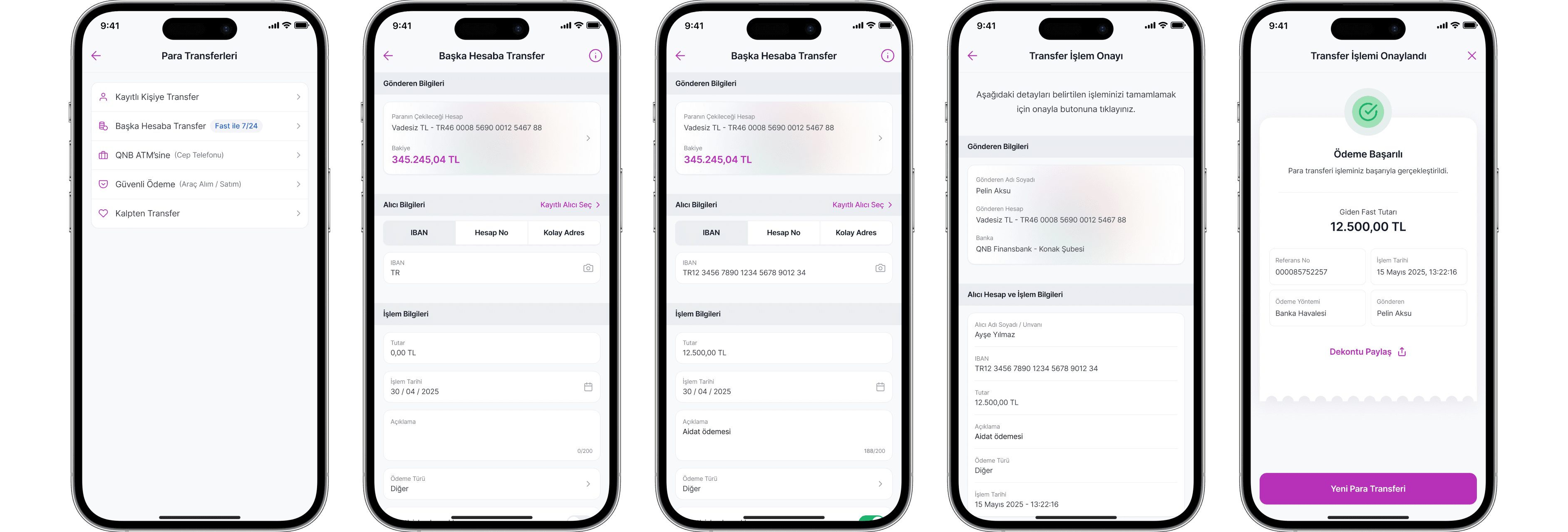
New UI & UX Design
Forms were simplified for clarity. Key details highlighted on the confirmation screen. Success screen redesigned to guide users with actions like “Share Receipt.”
Results & Added Value 📈
A clearer interface, smoother flow, and actionable feedback resulted in a more
confident and efficient transfer experience.
Reduced cognitive load
with a simplified flow
Increased user trust through
contextual, timely feedback
A modern, accessible UI aligned
with Enpara’s brand
Success screens that encourage next actions (e.g. sharing, saving)
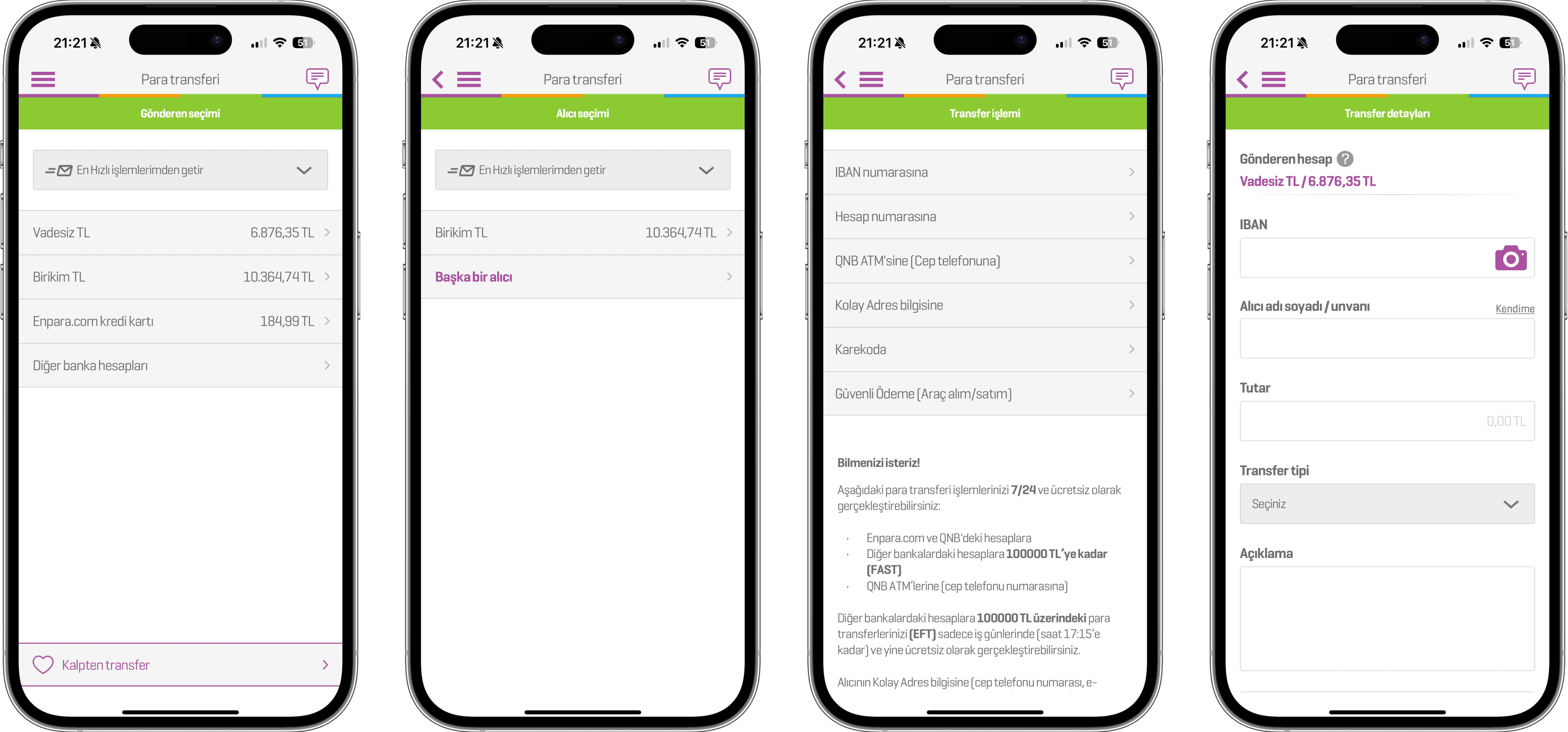
Enpara — Comparison Section 📱
Benchmark: Existing Enpara App Screens
These legacy screens were analyzed to identify usability gaps and
served as a foundation for the redesign strategy.