desıgn system
Topluyoruz Design System —
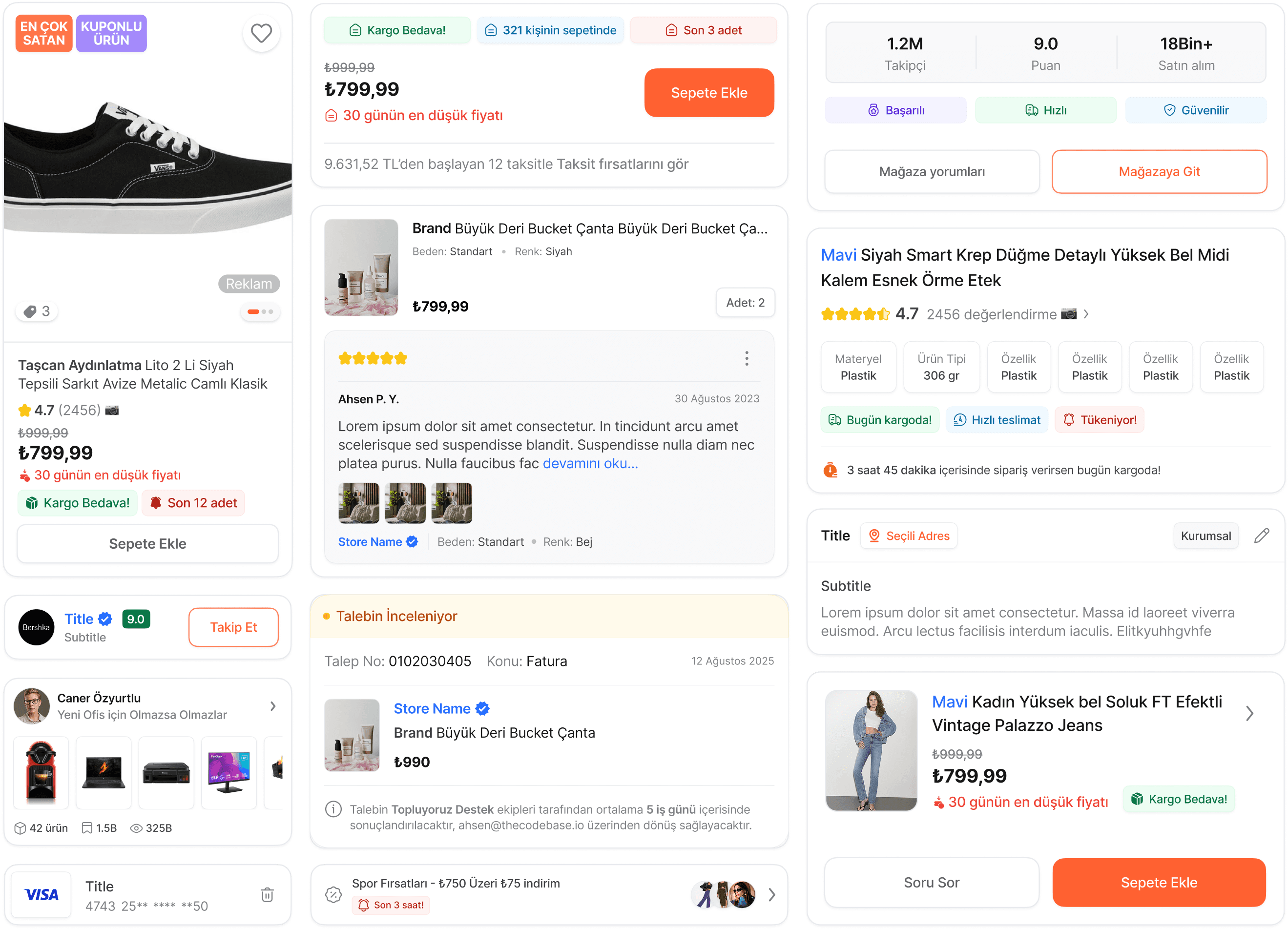
Scalable design system for mobile and web e-commerce experience
Role: Product Designer
Scope: Structuring component hierarchy using the Atomic Design methodology, creating a reusable component library in Figma, supporting both light and dark themes, documenting UI components, ensuring compatibility across mobile platforms.
Problem Definition 🎯
In Topluyoruz’s e-commerce projects, the number of UI components had grown uncontrollably, and multiple versions of the same element appeared with different styles on different screens. This negatively impacted both the user experience and the collaboration between the design and development teams.
Research & Audit 🔍
At the start of the project, I audited all Figma screens and past work, uncovering major inconsistencies—12 button styles, 4 font systems, and 6+ input variations—highlighting a lack of standardization that forced designers to recreate components and left developers struggling to find the latest versions.
System Architecture 🧱
I organized the system using the Atomic Design methodology:
Atoms: Button, Icon, Label
Molecules: Input Field + Label + Error
Organisms: Product Card, Bottom Sheet
Design Token Structure 📚
Semantic tokens such as
were defined.
The token system was made scalable with support for both light and dark themes.
Component Development 🧩
A total of 36 UI components were designed as part of the system, each built with responsiveness in mind using Figma’s Auto Layout features.
Every component was structured with clear variant definitions to ensure flexibility and scalability across different use cases.
Button
Designed with multiple variants including primary, secondary, ghost, icon-only, and loading states to cover all interaction scenarios.
Input Field
Built with clear states for default, error, success, and disabled, providing visual clarity and consistent behavior across forms.
Tab Navigation
Developed to support both top and bottom tab styles, ensuring compatibility with both Android and iOS platforms.
Product Card
A key UI element in the shopping flow, optimized for different screen sizes with emphasis on content hierarchy and clarity.
Bottom Sheet
Created with customizable heights and interactive affordances, supporting a range of use cases from filtering to quick actions.
Results & Impact ✅
A clearer interface, smoother flow, and actionable feedback resulted in a more
confident and efficient transfer experience.
Design production time
decreased by 40%
Component reuse rate
reached 80%
New designer onboarding time
reduced from 1 week to 2 days
User complaints about UI confusion
significantly decreased